Tuesday, 15 February 2011

Kate Moss by Mario Testino Inspired Photoshoot!

I have just written an essay on similarities and differences between two fashion photographs.... I chose two pictures of Kate Moss, one by Mario Testino and One by Corrine Day..... at the end of my essay as part of the conclusion I created a photo shoot in the style of my favourite photographer of the two........I decided to go with Mario Testino and his book on Kate Moss, I used inspiration from his natural and spur of the moment shots......these are the outcomes from the photo shoot along side the pictures that gave me the inspiration.....


Friday, 21 January 2011

Art - Fashion Identity.

   After going to the Barbicain last week I decided to take a 2nd trip to London and visited the Royal Academy of Arts, the exhibition being held was called Art - Fashion  Identity, there was some really skills and interesting pieces of art through fashion being shown....

This is a dress creatively made by Susie MacMurray, September 2009, Widow.
The dress appears to be made out of material but after studying up close you realise that it has been carefully constructed with individual silver needles pierced through black under material, this creates a spectacular effect and makes it into a piece of art for me.


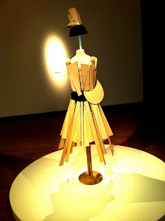
This constructed piece by Yohji Yamamoto caught my eye as I thought his use of wooden segments fixed together created a rigid structure yet allowed movement with the hinges.....

This is a Alexander McQueen lace couture, I thought this was beautiful and when looking closely it had obviously been made with a lot of skill and passion.
There was also some wigs and comtemporary forms of art being display, these three pieces especially stuck out to me ...

Wednesday, 19 January 2011

Future Beauty - 30 years of Japanese Fashion.

On a recent trip to The Barbican (a multi-art and exhibition hall in London). I went to Future Beauty - 30 years of Japanese Fashion with my college, it was really inspiring and exciting to see as these garments have never been shown in England before.


       The exhibition was held on two floors with separate sections for different designers, collections and times of fashion. When entering the first section of the exhibition 'In Praise of Shadows' (1980's) was the first collection of garments, mostly black, more aesthetic and more concealing than Western Fashion at this time. Western fashion styles were based on figure hugging, brightly coloured and silhouetted clothing and the Japanese fashion is very black and current body obsessions overlooked by covering up the figure and adding constructivism to create astonishing garments. A lot of Western designers took inspiration from these Japanese designers such as: Junya Watanabe, Rei Kawakubo and Yohji Yamamoto.


Junya Watanabe, Autumn/Winter 2009-2010.
Watanabe was known in the fashion world as the 'techno couturier' and trained under the influence of Kawakubo a lot of reflections from his work come out into Watanabe's garments.


Rei Kawakubo Spring/Summer 2009.

You would think that Japanese Fashion to be showing elements of traditional Japanese Fashion, but these designers have all showed use of constructivism in their work. Using draping, folding, pleating and origami techniques throughout there collections.

Watanabe showed me a lot of versatility throughout the exhibition over the years. From his concepts of cut and styling of fabric in his tailored trouser suits in Spring/Summer 2010.....
..... to his inspiring golden brown nylon net dress Autumn/Winter 1993-4
This was one of my favorite piece throughout the whole exhibition and proves that Junya Watanabe keeps his renowned status for creating unusual constructed garments.


He also has added traditional Japanese media into modern concepts of design in his amazingly detailed "Techno Couture" Collection Autumn/Winter 2000.
Origami paper folding techniques are carefully constructed into garments.....
Hiroaki Ohya.
...Tao Kurihara and his collection of garments had no need for sewing, just the use of twisting and knotting technique, similar to the traditional macrame textile construction....

Autumn/Winter 2006/7


... Rei Kawakubo with her Body Meets Dress, Dress Meets Body collection S/S 1997. Her garments feature extreme padding to extenuate the hips, shoulders, areas of the body and sculpting the rest....


...Yohji Yamamoto with his ultra feminine S/S 1999...


...Jun Takahashi and his influences from street fashion, manga art, bold colours and diversity in his 'Melting pot' collection 2000 ....


Japanese Fashion has influenced Western approaches to fashion, I'm sure you all known of Gwen Stefani and her cute Harajuki girl backing dancers they have been influenced by Japanese styles...


Japan is well known for being ahead of fashion and are amazing when mixing colours, different techniques and materials in garments. Issey Miyake was another designer that really stuck out for me at the exhibition, especially his Pleats Collection. He uses a series of intricately folded polygons, extensive design techniques and innovating outcomes....


Issey Miyake truely stole the show for me and is also internationally recognised for his work.
Overall my trip to 30 years of future fashion at the Barbicain was extremely insight full and inspiring. I will now be looking to use constructive techniques and Japanese approaches to my designs. I would really recommend viewing this exhibition if your ever in London.

Wednesday, 17 November 2010

Faking it Part 3.

I decided to go with design 4 to develop into a final piece. I will show you the sketches of make-up and styling for each of the 3 poses for my model. Along side will be the photos I actually created ....
Pose one.


 Pose 2.


Pose 3.

I then created a draft design to test out things and see what I need to improve, keep and sort out things.....

I like this draft but I feel that it obviously needs improving including the following: writing, background and lighting on each model pose matching........

I edited my first draft of my 'Faking it' assignment and this is the final outcome....


I have changed the background and saturated all three model images to the same lighting...... I put them all in proportion to wear they are standing and in scale with each other......I have used the original font from the official Urban Decay Make-up and enlarged the eye shadows....... I feel that I have improved the outcome and it looks to me like a actually Make-up advertisement.


Monday, 15 November 2010

Fashion Illustration.

The wikipedia definition of fashion illustration 'is the communication of fashion that originates with illustration, drawing and painting. it is usually commissioned for reproduction in fashion magazines as one part of an editorial feature or for the purpose of advertising and promoting Fashion makers, Fashion boutiques and department stores.'
 The beginnings of fashion illustrations date back the the sixteenth century and were inspired by exploration and discovery which also came about at this time. France became the leading contributor of fashion illustrations, this is an example of a early dated illustration...

                                            
                  .... By Wenceslaus Hollar- a mid C17th English dress illustration.

Fashion illustration through the ages was inspired and I think grew up to date with 'The Art Movement'.
In the early 1900's Art Nouveau appeared in fashion illustrations along side many other areas of design such as buildings, furniture and advertisement.
                                                         Dated 1914 - Georges Barbier.
  You can tell by looking at the picture that the art nouveau style is there, the oriental influence of a women on side view, the natural curving forms represented in the stance of women, hair and draping clothing.

By the 1920's illustrations became more angular and linear- exaggeration of body limbs to look longer and more appealing to the eye.
                                                           1920's 'Flapper girl' illustration.

After the 2nd world war illustration became a popular interest but grew more romantic and sophisticated...

                                                                      'Swing Time'

In the late 60's early 70's photography became very popular and pot art and abstract art emerged into fashion illustrations.
Today as we no it fashion illustrations are representing many different styles and inspiration and now are even digitally designed ... I searched the Internet and found a couple of illustrators that really stood out to me.


Holly Mae Gooch- American illustrator.
I like the way Holly uses simple line drawings and adding selective colour to high light certain features. In these two pictures she has highlighted the makeup and some tones in the hair this effectively drawn the viewer towards those areas.

Luis Tinoco- Spainish illustrator.
Tinoco is an artist and illustrator, this is his drawing of Lady Gaga. I like the way he has described her personality through colour and style. Here are some more of his work....
I feel that the colour in this picture is purposely placed behind the focus figure to highlight her black and white self.


                                                                    Howard Tagye

Lovisa Burfitt -Sweedish Illustrator .


                                                         Antoinette Fleur.


Cecilia Carlsteadt.
After being inspired from researching on Fashion Illustrators I might just try it out myself.......................

Thursday, 7 October 2010

Faking it Part 2.

I've come up with some spoof ideas of my own. I will choose one of these designs to digitally manipulate and make into a proper advert.

Design 1.

This is an advert for death by midnight poison instead of Dior Midnight poison perfume. I think this is a good idea but because of the recent issues in the news about suicide websites and help, I feel this would be too much of a sensitive subject to touch on.

Design 2.
Design 2 highlights the media's way of intruding celebrity's personal lives and plasters it over magazines and newspapers. This is my spoof magazine front cover called Wayne's World, all about Wayne Rooney, his recent cheating accusations and recent football flop.

Design 3

This design is a spoof dieting advert. There are so many dieting adverts around it's hard to tell what is facts or not. The media always pushes celebrity's drug habits and lifestyles into the public eye, I feel like its almost an advert for taking drugs ect...    So I've used this to advertise cocaine dieting in the style of a normal dieting advert, also I've added a celebrity success story to make readers more interested.

Design 4.
My final design is based on an advert for Urban Decay Cosmetics, only my take on the advert is highlighting ubarnisum taking over people lives. (City life, consumerism, dark, edgy, fashion) I will use the same model in three different poses in the same scene. 1 lent against wall smoking. 2 in a shopping trolley full of cosmetics and product. 3 using a graffiti spray as hairspray with a mask on. The new collection of colours is called the Corruption Collection. I've also used a colour chart of the new range of colours.    

Wednesday, 29 September 2010

Faking it Part 1.

I've been set a task to digitally manipulate imagery and apply it to my version of a certain advert/magazine....
To begin with I started to research other invasions of magazines and adverts. Here's some of my findings from googling adbusters....
This is a 1950's style advert for Prozac done as if it was a washing detergent.

This is a striking message putting across that Jello clogs your artery's like cigarettes.
This is a direct message stating that vodka is impotence. I think that they have created it well by crushing the glass bottle.

Calvin Klein ads always have sexy, muscly men promoting there goods, here there saying the reality for the average man is the body in the picture.

This is a quote from the adbusters website-
''We are a global network of artists, activists, writers, pranksters, students, educators and entrepreneurs who want to advance the new social activist movement of the information age. Our aim is to topple existing power structures and forge a major shift in the way we will live in the 21st century.Adbusters is at essence an ecological magazine, examining the relationship between people and the environment, both the material environment and the mental environment.”