Wednesday, 9 March 2011

My Fashion Illustration - Urban Textures!

I have earlier posted about fashion illustrations and showed you the artists that I admire, Holly Mae Gooch is one of my favourite. I have now been set a task to create my own fashion illustration adding the use of digital media and using the theme of urban textures....I started by taking some manual rubbings from urban/man made materials ......

I then starting thinking of my illustration and came up with the idea that I would create a photo shoot around the urban textures theme..... I started by sketching down some thoughts and ideas and came up with my final idea.... I wanted to project an PowerPoint presentation of
 urban textures onto a mass amount of draping material. I created a scene in which a beautiful model was leaning out of a high inner city window with her hooded cloak draping down from her to the floor and spread out in the aim of projecting onto it..... Having my final idea I set out bringing all the components needed to finalise the actual photo shoot......
 I chose an urban setting for my location, in Bristol inner-city Fire training tower ....


I had to get a number of permissions from the officials at the fire station as is is an active training tower.... a health and safety risk assessment was carried out on the tower specifically for this photo shoot so that everyone involved would be safe...especially the model who would be climbing ladders and harnessed to a safety rope from the inside......


I visualized the model being sat leaning out of one of the highest windows, innocent looking......Her long, draping, hooded cape falling from her to the floor....I knew that by creating my illustration on a large scale I would come across some obstacles.....the first Major one was finding the amount of material that I would need as I wanted it to be wide and long. Luckily I came across a whole roll of shiny, white, nylon material at the local scrap store and brought it for only £4..... I cut three pieces equally 30meters long and sewed in the side seams together to make the material 7meters wide... I added a hood and made a complementary dress for the model to wear over her harness......


I then went around Bristol taking photographs of urban textures to put into my PowerPoint presentation......


I then organised a professional photographer to attend the photo shoot and take the shots on the day of the photo shoot .... Stephen Tilley ( http://www.stephentilleyphotography.com/).....
I also arranged my sister to be the model so everything was organised for the actual day....
I designed the hair and make-up to complement the setting and theme of the shoot.... giving her tumbling, curly locks and bright, white and innocent looking make-up......


When we arrived on location I went up the tower to the third floor and placed my model position advising her on different poses and looks..... a firefighter fixed her into the harness and attached her to the building, he stayed hidden in the tower throughout the shoot... I then went back down to the ground with the photographer to direct the photo shoot.....
I then came across my 2nd major obstacle - the projection I created wouldn't show up during daylight onto my material.... I had to think on the spot, so I decided to carry on with the photo shoot then add extra urban textures into the final image using photoshop... the location was already an urban inner-city setting....so after the shoot Stephen and I sat down to photoshop to create the final images...
This picture is a long shot of the whole setting, I did this to show the scale of my illustration....the only thing I have changed on here is the colouring of the sky, it brings a dramatic effect to the image.....

Here I added buildings and cranes into the skyline of this photo to give more urban textures to the outcome... I also let the material blow up in the wind to create a swooping curve....

I got experimenting with photoshop and added different impacts of sky in the background.... I feel here I have created a 'repunzel' style outcome....

Again here I have only selected the model and the tower and put her in a scary looking wood and carries on with the 'repunzel' look.
I also had the whole day filmed to capture the organising and production of the day, I wanted to make a documentary of myself and how I work... I will be posting the edited version of this documentary on a later date.......
I actually think that my outcome was more effective without the projection onto the material as the whiteness and length is the feature and I feel that maybe this would be lost if the projection had covered up brightness of it....Overall I'm very pleased with the final images of my illustration and I can use the projection idea in another one of my photo shoots.


Tuesday, 15 February 2011

Kate Moss by Mario Testino Inspired Photoshoot!

I have just written an essay on similarities and differences between two fashion photographs.... I chose two pictures of Kate Moss, one by Mario Testino and One by Corrine Day..... at the end of my essay as part of the conclusion I created a photo shoot in the style of my favourite photographer of the two........I decided to go with Mario Testino and his book on Kate Moss, I used inspiration from his natural and spur of the moment shots......these are the outcomes from the photo shoot along side the pictures that gave me the inspiration.....


Friday, 21 January 2011

Art - Fashion Identity.

   After going to the Barbicain last week I decided to take a 2nd trip to London and visited the Royal Academy of Arts, the exhibition being held was called Art - Fashion  Identity, there was some really skills and interesting pieces of art through fashion being shown....

This is a dress creatively made by Susie MacMurray, September 2009, Widow.
The dress appears to be made out of material but after studying up close you realise that it has been carefully constructed with individual silver needles pierced through black under material, this creates a spectacular effect and makes it into a piece of art for me.


This constructed piece by Yohji Yamamoto caught my eye as I thought his use of wooden segments fixed together created a rigid structure yet allowed movement with the hinges.....

This is a Alexander McQueen lace couture, I thought this was beautiful and when looking closely it had obviously been made with a lot of skill and passion.
There was also some wigs and comtemporary forms of art being display, these three pieces especially stuck out to me ...

Wednesday, 19 January 2011

Future Beauty - 30 years of Japanese Fashion.

On a recent trip to The Barbican (a multi-art and exhibition hall in London). I went to Future Beauty - 30 years of Japanese Fashion with my college, it was really inspiring and exciting to see as these garments have never been shown in England before.


       The exhibition was held on two floors with separate sections for different designers, collections and times of fashion. When entering the first section of the exhibition 'In Praise of Shadows' (1980's) was the first collection of garments, mostly black, more aesthetic and more concealing than Western Fashion at this time. Western fashion styles were based on figure hugging, brightly coloured and silhouetted clothing and the Japanese fashion is very black and current body obsessions overlooked by covering up the figure and adding constructivism to create astonishing garments. A lot of Western designers took inspiration from these Japanese designers such as: Junya Watanabe, Rei Kawakubo and Yohji Yamamoto.


Junya Watanabe, Autumn/Winter 2009-2010.
Watanabe was known in the fashion world as the 'techno couturier' and trained under the influence of Kawakubo a lot of reflections from his work come out into Watanabe's garments.


Rei Kawakubo Spring/Summer 2009.

You would think that Japanese Fashion to be showing elements of traditional Japanese Fashion, but these designers have all showed use of constructivism in their work. Using draping, folding, pleating and origami techniques throughout there collections.

Watanabe showed me a lot of versatility throughout the exhibition over the years. From his concepts of cut and styling of fabric in his tailored trouser suits in Spring/Summer 2010.....
..... to his inspiring golden brown nylon net dress Autumn/Winter 1993-4
This was one of my favorite piece throughout the whole exhibition and proves that Junya Watanabe keeps his renowned status for creating unusual constructed garments.


He also has added traditional Japanese media into modern concepts of design in his amazingly detailed "Techno Couture" Collection Autumn/Winter 2000.
Origami paper folding techniques are carefully constructed into garments.....
Hiroaki Ohya.
...Tao Kurihara and his collection of garments had no need for sewing, just the use of twisting and knotting technique, similar to the traditional macrame textile construction....

Autumn/Winter 2006/7


... Rei Kawakubo with her Body Meets Dress, Dress Meets Body collection S/S 1997. Her garments feature extreme padding to extenuate the hips, shoulders, areas of the body and sculpting the rest....


...Yohji Yamamoto with his ultra feminine S/S 1999...


...Jun Takahashi and his influences from street fashion, manga art, bold colours and diversity in his 'Melting pot' collection 2000 ....


Japanese Fashion has influenced Western approaches to fashion, I'm sure you all known of Gwen Stefani and her cute Harajuki girl backing dancers they have been influenced by Japanese styles...


Japan is well known for being ahead of fashion and are amazing when mixing colours, different techniques and materials in garments. Issey Miyake was another designer that really stuck out for me at the exhibition, especially his Pleats Collection. He uses a series of intricately folded polygons, extensive design techniques and innovating outcomes....


Issey Miyake truely stole the show for me and is also internationally recognised for his work.
Overall my trip to 30 years of future fashion at the Barbicain was extremely insight full and inspiring. I will now be looking to use constructive techniques and Japanese approaches to my designs. I would really recommend viewing this exhibition if your ever in London.

Wednesday, 17 November 2010

Faking it Part 3.

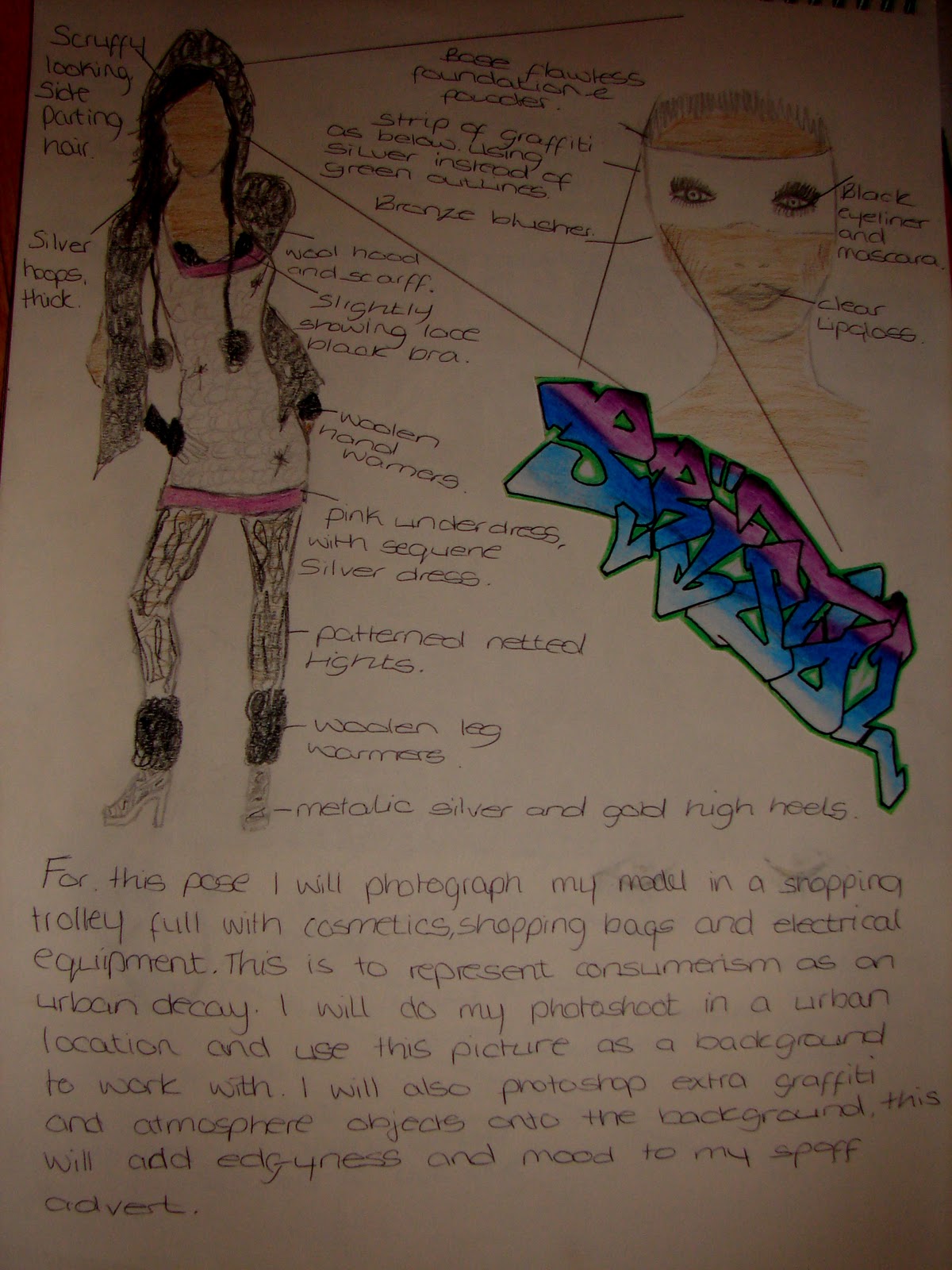
I decided to go with design 4 to develop into a final piece. I will show you the sketches of make-up and styling for each of the 3 poses for my model. Along side will be the photos I actually created ....
Pose one.


 Pose 2.


Pose 3.

I then created a draft design to test out things and see what I need to improve, keep and sort out things.....

I like this draft but I feel that it obviously needs improving including the following: writing, background and lighting on each model pose matching........

I edited my first draft of my 'Faking it' assignment and this is the final outcome....


I have changed the background and saturated all three model images to the same lighting...... I put them all in proportion to wear they are standing and in scale with each other......I have used the original font from the official Urban Decay Make-up and enlarged the eye shadows....... I feel that I have improved the outcome and it looks to me like a actually Make-up advertisement.